Showing posts with label Prismacolor pencils. Show all posts

Saturday, July 29, 2017

Diva Challenge #326: A Preteen, A Metaphor, and Mindfulness

This week's guest blogger is Elisa Murphy.  The basic part of her challenge is to do a mono tangle of 'Nzeppel.  You can read the details of the challenge on I am the Diva.  She focused on some of the issues of fitting in but I think the focus was really on really trying to engage the mindfulness of the Zentangle® art form.  That was not really a problem when I was doing the tangle as it does use repetitive strokes. I think this helps with the mindfulness.  I find any tangle that uses only a few of the elemental strokes and you just keep repeating them to create. the pattern, and do not have to keep looking back at the step out for what comes next, helps me get into that zone.  Case in point, I was working on something and was using paradox while I was a vendor at an event.  Now I know for some your reaction might be, " How in the world can you be mindful when doing Paradox".  Well, a couple of times I was so engrossed I did not notice people standing at my table looking at items.  Don't think I lost any sales thankfully. Now back to the challenge.  I lost a little of the mindfulness when I decided to add color. That is always a challenge for me. I have looked at it a number of times and while not completely satisfied with it, it is growing on me.  Think part of it is that I would have usually added some embellishments to this but chose not to to stay with the monotangle limit.   Here is what I came up with. I hope you enjoy it.


Tangle used: 'Nzeppel
Color done with Prismacolor pencils. Used a yellow, a yellow orange and a red. Did a lot of layering and also smoothed with a blending pencil.  I was not thinking in that I also used a cool gray Prismacolor pencil for the spaces in 'Nzeppel.  When I used the blending pencil, it got a little murky but additional layering helped. 

I have not looked at any of the other things that have been submitted. If you have not either, would suggest you go to I am the Diva and look at some interesting pieces of art.  

Thanks for visiting. As always, comments are welcomed, encouraged, and appreciated.

Go Tangle !!


Tuesday, July 4, 2017

Special ZIA Update : Finally finished

Had earlier posted this ZIA when I was working on it. I finally finished it. just not as soon as I would have liked. As a reminder, this is what it looked like at the first post.


The actual drawing is about 6" x 10" 

I used various size Microns to do the outlining and the tangles. The color was done layering Prismacolor pencils. For blending I first used a white Prismacolor pencil and then also used the Prismacolor blender.  Here is the finished product. I hope you enjoy it.


Tangles used starting in the lower left corner: Paradox, Poke Root and Poke Leaf. 'Nzeppel, Fassett, & Shattuck.

In the original post I mentioned I was not sure what I was going to do with Paradox and Fassett. I decided to only do graphite for shading on these two tangles. 

It will soon be on it's way to Alabama. 

Thanks for visiting. As always, comments are welcomed, encouraged, and appreciated.

Go Tangle !!   


Saturday, June 24, 2017

Larger ZIA for a special occasion.

Do not usually do large pieces and it is really unusual for me to do a special  piece. This one is for an anniversary. Had hoped to have it done before the date but will not make it. The other thing that is less often for me is using color, particularly coloring tangles.  I have used color washes more frequently.  Was not sure about using color at all and almost did it only in basic black and white. Decided to take a risk and add color.

Not sure if I will put color on all the tangles or will do a couple with just graphite shading. Thinking of using this on the Paradox and the Fassett. Still have not decided what I will do.

Did not measure this to get an exact size. It is done on an 11x14 sheet.  I am guessing it is about 10x7.5.  Will have to be custom framed when done. Will get to that later.

Open to any suggestions about this. Color is done using layered Prismacolor pencils.  Will post more on this when I post the finished work.

Here is what I have so far. I hope you enjoy it.


Thanks for visiting. As always, comments are welcomed, encouraged, and appreciated.


Go Tangle !!

Thursday, March 30, 2017

Diva Challenge #309: New Official Tangle Noom

Do not usually do this but a pressed for time. I have used this tangle on a number of things. Posting something a little different than the usual tile. I hope you enjoy it.


Tangles used Noom, Tierso, Knightsbridge, Merryweather 
Found out about these from someone else. They can be fun to make but do take time. Drew the tangles with Micron and did the color and highlighting with PrismaColor pencils.

Have not looked at any other things posted. Would encourage yo to go to I am the Diva to see some great art. 

Thanks for visiting. As always, comments are welcomed, encouraged, and appreciated.

Go Tangle !!

Thursday, March 23, 2017

Diva Challenge #308: " MacNCheese"

This week's challenge was really appropriate. The month of March has been stressful so far. Hoping that it calms down for the rest of the month. This chalenge really served two purposes. The MacNCheese part for me as I needed something that was less stressful and it allowed me to do a tile for someone else.  I like these challenges as it really allows me to get back to the basics. What I consider my MacNCheese tangle varies from time to time, but Shattuck has always been one. Cadent is also one that I use alot. I kept it simple here and did not do any embellishments. There are a lot of ways to vary this tangle. The touch of color was for the person I gave the tile to. Purple is there favorite color. I kept this simple also.   I used a Zendala tile for this really just because it was the first thing that I pulled out.  Here is what I came up with. I hope you enjoy it.


Tangles used: Shattuck, Cadent. Color and highlighting done with PrismaColor pencils.

Sorry for the quality of the photo, I usually take pictures with my digital camera and a tripod. I did not have these with me so took with my Ipad.

I have not had a chance to look at the other things posted on I am the .Diva . One other plus with challenges like this is that there can be quite a variety of tangles used. Is fun to see what people perceive to be their MacNCheese tangle.  If you have not been there all ready, click on the link above to see some great art.

Thanks for visiting. As always, comments are welcomed, encouraged, and appreciated.

Go Tangle !!

Thursday, March 9, 2017

More eggs: Two different chalkboard styles

A couple of days ago I posted a plastic egg that I had done after seeing one done by Liz Drake. At the time I indicated that I would post more pictures after I had a chance to work on the two chalkboard style eggs. Was able to complete one of each. Here is what the eggs look like before any tangling.


The yellow and black ones are the chalkboard ones. The black come in packages of 12. The yellow come in a package of mixed colors. There are green, blue, lilac, and yellow. I used a variety of pens on the eggs. Here is the picture of the original one that I did on the white egg.


The tangles were drawn on this with a black 01 Micron. The color was done with PrismaColor pencils. I used a white PrismaColor to blend and tint. 

Here is a picture of the other two after I had finished tangling them. 


I did the black on first. This was done with Bistro chalk markers. They can be a little difficult to deal with as have to be careful to let them dry or they will smear or rub off. If you hold them too tightly, the color will also come off. Tried to keep the tangle simple and limited. This has a variation of Mumsy, or Arc flower, Diva Dance, and Knightsbridge.

The Yellow one was done a little differently.  The tangling was done with different colored ultra-fine  point Sharpies. One thing with Sharpies versus the Microns is that the Micron ink does not come off on your hand when you hold them. Kind of unavoidable when you are drawing on them.  When I work on some more I may use the colored Microns or the IdentiPens. I added the color with Tombow Irojiten colored pencils. They are similar to the PrismaColor pencils in that they are a wax base. I just do not have as many of them. I tried adding colord pencils to black ones but they do not show up. Did not try any of my other colored pencils. Think the same thing would occur.  The tangles are Cubine, Rain, Printemps, and a Jewel variation. 

They can be fun to do but they are a little labor intensive.  Will have to see how many of these I can get done before Easter. Will have to work hard.

Thanks for visiting. As always, comments are welcomed, encouraged, and appreciated.

Go Tangle !!

Tuesday, March 7, 2017

Something for Easter: Tangled egg

This is going to be hopefully a brief post. I have not done things at Easter because I could not find materials to work with that I was comfortable with. One of the nice thing about FB is that in groups you can find out about some very nice techniques and materials. That is where this came from. Was looking at my New Feed and saw a unique decorated egg done by Liz Drake. I really do not remember the page it was on. You can find out some information about her on her FB page Tangled World.

Anyway, these eggs are a plastic that you can use Microns on, as well as Sharpies, Have not tried IdentiPens but would think that these would work also. The color is added with PrismaColor pencils. Used the tinting technique using the white to blend and soften some of  the colors. There are plain white eggs, and two style chalkboard eggs. I have not had time to do anything with the latter yet. Will post more when I get to those.

Here is the first one that I did. I hope you enjoy it.

Tangles used: Tierso,Noom, Merryweather, Knightsbridge
Tangles drawn with Microns and Sharpies, Color done with PrismaColor pencils


Will go into more detail about this later. This has not been sealed with anything yet. Plan on using a spray glossy finish sealer. 

Thanks for visiting. As always, comments are welcomed, encouraged, and appreciated.

Go Tangle!! 

Friday, January 27, 2017

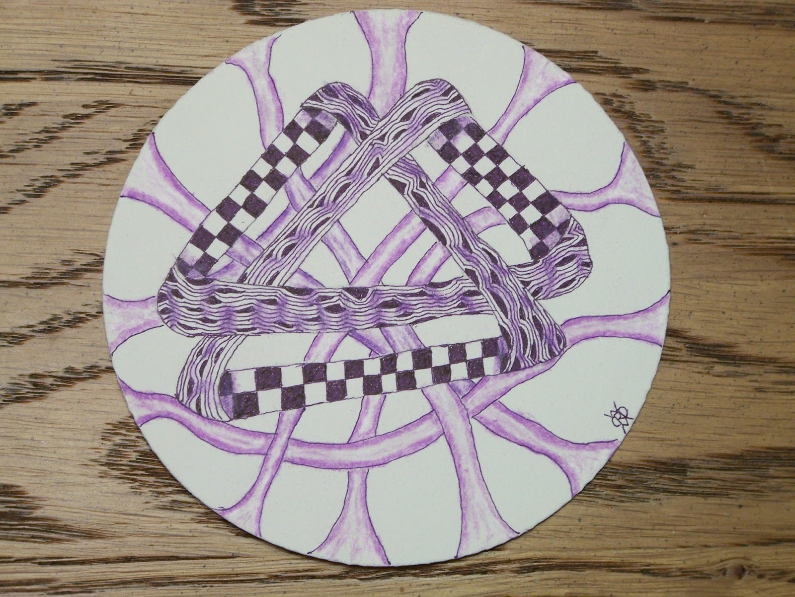
Diva Challenge #300: " Moebius Syndrome Awareness Day"

I have participated in a number of Diva Challenges over the last five years. This is a repeating one as it is to increase awareness about a neurological disorder that her youngest son has. The challenge is to  use the Moebius Syndrome Foundation's logo and if you want, the color purple which is the their representative color. It is also significant in that is the 300th Diva Challenge. One usually learns different things when doing the challenges. Sometimes it is a new tangle, or technique. The one thing I learned in this challenge, after a number of times trying is a way to deconstruct the logo so I could use it as the string on the tile.  Here is what I came up with. I hope you enjoy it.


Tangles used: Printemps, Shattuck, Heartvine, Noom
Highlighting and color were done with Prismacolor pencils


I still need to work on using the colored pencils, The shading gradation did not turn out like I would have wished. I did use a layering effect to help with the smoothing and blending.  Overall I am pleased with the outcome.

I have not looked at any of the other submissions on I am the Diva. I hope to have some time to do so and would encourage any of you that have not all ready done so, to go and look at what is there. I would also encourage you to take the time to comment on the different art. It is greatly appreciated. You can click on the above link to go there directly.

Thanks for visiting. As always, comments are welcomed, encouraged, and appreciated. 


Go Tangle

Wednesday, June 22, 2016

Some more new things: Finished shadow box with tangled insert

I am not sure if I posted something earlier on here or it was on the CZT FB page about these shadow boxes that I got at Hobby Lobby. Was not sure when I would get around to doing anything with them. I was able to work on them sooner than I expected. Here is a picture of one of the shadow boxes before any thing was done on them.  The box is about 2.5" square.


Was not exactly sure what I wanted to do with them. I thought of painting the box and then tangling on that. That would be a lot of work and was not sure that I wanted to tackle that right now. When I first saw them my first thought was that I could do a tile to put in the window. That is what I decided to do. I still wanted to do something with the box itself but did not like the idea of painting them. I decided to just varnish one of them and the other two I stained first and then used Tung oil as a finish. here is what they looked like when done with this process.


The lower right is the natural finish. Did not show up as well in the picture. The stain is pretty light and I did not let it soak into the wood for long because I wanted the stain but not something that dark.The stain is a Minwax product, Golden Oak. 

For the inserts I used Bijou tiles. I had to trim a little to fit into the window and as you will see later, some of the tile is hidden because of the size of the window.  Here are pictures of the tiles I did. 


I realized after taking the picture that you could not really see them that well. Here are pictures of each one individually with a few comments about them.

This is the first one that I did. The color is done with layered Prismacolor pencils. Was pleased with the way that it turned out.


This was actually the last one I did . Wanted to do more of a traditional tangle tile. Used Cubine and 'Nzeppel as the tangles. I did use layered Prismacolor pencils again to add the color.


For this last one, I started out doing a water color wash. I used Faber-Castell pencils. I liked the wash but was not sure wanted I wanted to do. When I originally looked at it with the blue on the sides (sorry, did not take a picture before I started tangling on it). Was not too taken with it. I began rotating the tile and noticed on the one orientation the blue looked like sky and water and the middle section looked like hills. I liked that but was still not really sure what I wanted to do. Was not sure what tangles I could use. I admit, I was also worried about how it would look. Anyway I pushed ahead and used the brown Micron for most of the work except for the lower blue section. Does not show up but also used as a white Prismacolor pencil to try to put in some clouds in the top section of blue. I was pleased with the result.  Here is what the finished tile looked like.   


Used a tangle from Sandy Steen Bartholomew's "Totally Tangled" book Swell. For the hills, I used Diva Dance and a Shattuck style stroke. I decided to leave the sky and the one section untangled.  I hope you enjoy it and hope I did not add too much to it. 


Okay, enough rambling. Here are the finished items.


Think they turned out well.

I appreciate your patience if you got all the way through this post. I have some other new things that I am working on but they are not ready post. Combined a little tangling with pyrography. Stay tune to see those.

Thanks for visiting. As always, comments are welcomed, encouraged, and appreciated.

Go Tangle !! 

Friday, January 22, 2016

Diva Challenge # 251: "Moebius Syndrome Awareness Day"

This week's Diva Challenge is a special one. Special for the participants and The Diva herself. Those who have participated, or followed her challenge know that this is a syndrome that impacts her family. After many trials, her youngest son was finally diagnosed with Moebius Syndrome. Dealing with this has been quite a journey for the family. It is one that the Diva has allowed us to be a small part of by posting pictures and updates or her son as he is growing up and participating in this challenge which she also links with the Moebius Syndrome support group. You can read more about this her blog, I am the Diva.

Was not sure that I was going to get this done. It is a different tile for me. I chose to use a Zendala® tile instead of the standard square tile. I also used color a lot but it is still monochrome as it is only one color. Not sure I have done this before. I also left a lot of negative space. I have gotten more comfortable with this but it still something I will mull over a lot. Here is what I came up with. I hope you enjoy it.


Tangles used: Knightsbridge, Diva Dance ( in honor of the Diva herself), and Hollibaugh

I used a purple micron for the Moebius Syndrome logo and to outline Hollibaugh. The highlighting/shading is down with multiple Prismacolor pencils; lilac, violet, parma violet. I have used the Prismacolor pencils before but I am not sure that I used them on an official tile before. I used the blending pencil but was not really pleased with the way that it blended. I could smooth it out but not really get gradients that well. Had to use very light pencil  to get that effect. This was, I think the first time I used a Prismacolor pencil for so much highlighting. I am pleased with the result. 

I am hoping to get a chance to look at the other submissions for this challenge. I also have a class tomorrow to finish preparing for also. If you have not all ready done so, I strongly encourage you to visit I am the 
Diva and look at the great art that others have created. If you do, take the time to comment on the sites that you visit. I know that most people appreciate this. Try it yourself, even if you do not submit it for others to see.

Thanks for visiting. As always, comments are welcomed, encouraged, and appreciated.

Go Tangle !!


Wednesday, August 5, 2015

Diva Challenge #229: "+/ - ", Guest Blogger Sandy Hunter,CZT

These week's Guest Blogger is Sandy Hunter. She may be best known for some of her tangles and her tangle remix. They are fun to do . Her challenge is not just to have some negative space, but to make it the focus of the tile. This was harder than I thought. I have not used strings for a while. I usually just pick a tangle and start. I though about doing this and seeing what negative space was left. I decided to not do this and settled for a string with a basic star/flower shape. I had some ideas of what I wanted to do but I am not sure that it ended up leaving the white space as the star of the tile. I decided to use the black/brown color combo and this may have taken away from having the negative space be the focus. The tile itself, I like but not sure that it was successful in addressing the challenge. Here is what I came up with. I hope you enjoy it.


Tangles used: Zander, Shattuck, Merryweather
Shading done with HB, 4B graphite pencils. Color highlighting done with Prismacolor Pencils (Golden rod, Burnt Ochre, and White. 

When I decided to use Merryweather, did not realize that it was a tangle developed by the Sandy Hunter. Went to check the step-out and then saw it. Decided to keep it as it seemed to fit. If you  have not all ready done so, would encourage you to go to I am the Diva to look at the pieces of art that have been posted. 

Thanks for visiting. As always, comments are welcomed, encouraged, and appreciated.

Go Tangle !! 

Monday, July 27, 2015

More tangled gift bags

I did not intend to post a lot of these but some unique things happened as I was doing them. Here is the first one that I did. It is on brown craft paper and is about 5" x 8" I used Prismacolor pencils using a single color with white to create a tone. It generally lightens the color.


I purchased a number of other bags as well. These are larger and measure about 8"x 9". Here is one that has a silver frosted finish. I again used Prismacolor pencils with white for the tone and tried to do some with just the white. That did not show up as well in the pictures and it is not as strong in reality unless the light strikes it just right. I kind of reminded me of working with the frosted glass ornaments that I did a couple of years ago. as I usually do, I used a blending pencil on the Prismacolor pencils to smooth out the color.  Here is what the frosted one looked like.


I used a purple and a green Prismacolor pencil. For the black shading, I used a regular graphite pencil but also used the blender on this as well. I layered it to get the different intensities.

Here is the last one. This is the one that was the most surprising. The bag is the larger size and it is just a plain white paper. It is almost like working on a tile as far as the color goes. The paper is not the same quality. I say that as I approached it with the idea of using both black and brown microns. It developed in true Zentangle® style. I had no idea of what I wanted to do. I did not want to use a string so I started with a single circle. I did the one in the upper right first. I then did the one with Gneiss and the one with Drupe was last. I liked the combination of the black and brown. Then there became the issue of how to finish off the background. Probably got carried away with Opsess on the bottom but Florz was an easy choice. I did not want to do too much embellishment with it. I again used Prismacolor pencils for the highlighting and fill in Opsess. I am really pleased with the way that these turned out.

For those of you familiar with different tangles, I did not really make that many mistakes on the bag. A couple of the Bronx Cheers were to cover up some errant pen marks. Most of them were additions to provide a little balance after having so few on the cover.


Thanks for visiting. As always, comments are welcomed, encouraged, and appreciated.

Go Tangle !!

Friday, July 10, 2015

Another thing that did not move: Tangled Gift Bags with a Little Color

A couple of years ago I did some gift bags for the office staff. I unfortunately did not take any pictures of them. I am trying to get a variety of things together for some events over the summer. Thought I would do some gift bags again. Have a variety of them but started out with the brown craft paper ones. Tried to add a little color to this rather than just using white highlights.  Here is what I came up with. I hope you enjoy it.


Tangles used: Pea-nuckel, Intwine, Dragonair, Antidots, &Chainlea
Highlights and shading done with Prismacolor Premier pencils.

Tried a little different thing with some of the color. The green and blue are a single color then white over the color. If I do it again I may try some layering of colors before I add the white. It is really experimenting trying to get the color tint that you want. The brown is actually the layering I did on one of the recent challenges. I used white but instead of it being the last color it was in the middle. It is Goldenrod, White, and Burnt Ochre. 

Thanks for visiting. As always, comments are welcomed, encouraged, and appreciated.

Go Tangle !!   

Wednesday, July 1, 2015

Diva Challenge #224: "Monotangle - Tipple"

This week's Diva Challenge is an interesting one. It is interesting not only because it is a monotangle but also because of the tangle that is used. She chose Tipple. Normally, will use this tangle to fill or augment a tile or other tangles. Trying to do a whole tile with it reminds me of the stippling challenge that was done a while back. You are creating something else with this tangle. I am looking forward to seeing a lot of really unique and interesting things that people have done.

There was something else that was unique about this challenge. I have no other art training other than Zentangle®. Before that it was only the mandatory classes that I took through elementary school. I have known people that who can form an image in their mind and they translate it to paper. That does not describe me. Over the almost 4 years I have been tangling there have been times when I was doing a challenge or just working on a tile that before I started, I would have some of idea of what I hoped/wanted it to look like. Was not really pre-planned, just a concept of what I wanted at the end. I know that seems a little contrary to the whole Zentangle process but not really. I learned to enjoy what the result was. I also learned to not make any judgments about a tile until it was done. It was not always what I envisioned but it did not mean I did not like it. Sometimes, I liked it better than what I had envisioned before I started. Well, this tile was the only one that I can remember that the end result really was like what I envisioned.  I will say more about it after the picture.  Here is what I came up with. I hope you enjoy it.


Shading is always a challenge for me even when I like the result. It is particularly a challenge when I am trying to shade any color or in this case the brown micron. I have tried a number of things but never was all that pleased with the result. This was done with a layering of Prismacolor pencils. I probably tried about 15 different combinations before I came up with this. This is probably the best one that I have come up with. It is first a layer of Goldenrod, then White and lastly Burnt Ochre. I then used the blending pencil to smooth and burnish it. As I said, I was pleased with the result. 

I have only seen things that have shown up on my blog reader and that is not many. Looking forward to seeing a number of great tiles. If you have not done so, go to I am the Diva and check them out. Try it your self even if you do not post it.

Thanks for visiting. As always, comments are welcomed, encouraged, and appreciated.

Go Tangle !!                                               

Wednesday, January 7, 2015

Trim-A-Rim: Final Versions

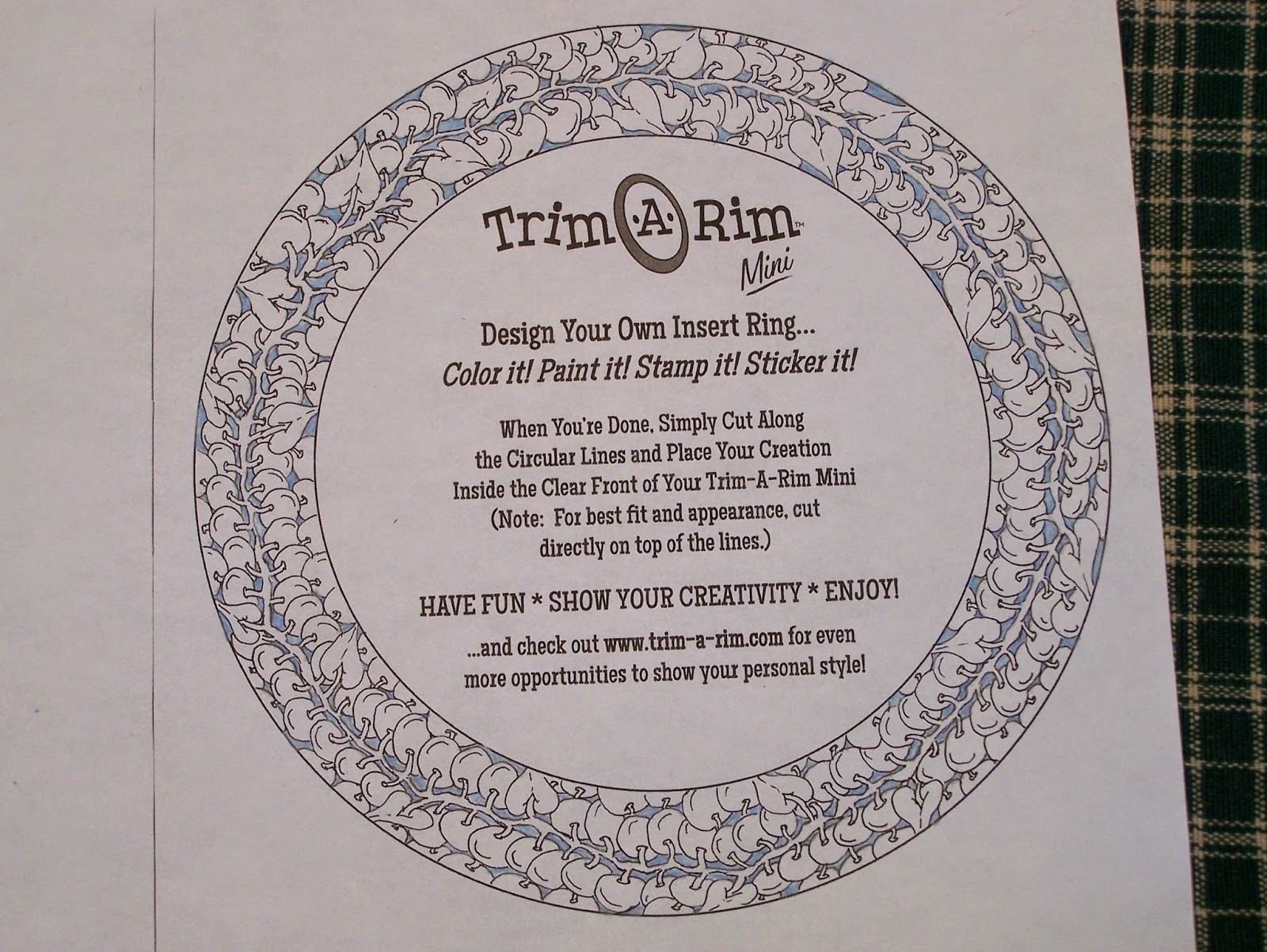
Finally was able to complete this. This comes in two sizes and I worked on the smaller one first. Don't have the exact dimensions but can find it by going to their web site by clicking here on Trim-A-Rim. I think the smaller one is about 7" and the larger one is about 10".  I posted the color version before. Here is the black/white version with shading. Not sure how well the shading shows up in the picture.


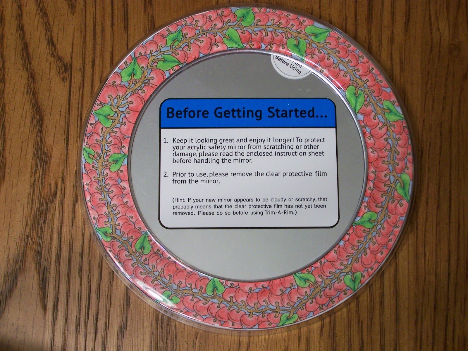
They come with some ready made rings, a stencil with shapes to create you own and two blank templates, which is what I used. It also includes a small black dry erase marker and some magnets that can be used to attach a message to it.  Here are pictures of it in the unit. First the B/W version.


Did not take all the packaging off as I am not sure whether these will be gifts or they will end up as sales items. 

Here is the color version. First with the mirror.


And now with the Dry erase board side


Forgot to mention that on the back of the ring there are about 5 magnets so that it can be attached to the inside of a locker. There is also a molded key hole that can hang it on a wooden door or wall with a nail. 

The color one was pretty labor intensive. not sure what I will do with the larger one. Right now am thinking more of a monotangle or duotangle just to keep it simple. If it is not too long before I get it completed will probably post it. 

Thanks for visiting. As always, comments are welcomed, encouraged, and appreciated.

Go Tangle !!

Thursday, January 1, 2015

Trim-A-Rim : First version

I posted a plain tangled version of this previously. I asked for some responses about whether to use color or traditional black and white. Did not receive a lot of responses either way. Think that part of the problem is that people were too busy celebrating the New Year. At least it is the position that I am going with. I really was undecided. I wanted to try color, not so much because I like using color but mostly because I have a new set of Prismacolor pencils that I had not tried out yet. Even had a blending pencil, which I have never used before. My only art training is Zentangle® so anything else I do is a combination of experimentation and remembering a few things I have heard other people mention. I took some pictures of the process along the way. Did not photograph everything. Were more at the end as I was getting a little more comfortable with the blender and it also was the most dramatic change from beginning to end. I plan on doing one in black and white later. Here is what I came up with. I hope you enjoy it. I will post a picture of it in the frame after I have the other one done.  If interested in seeing the product itself click on Trim-A-Rim here.


Just as a reminder, here what it looked like when I started.


The first color I added was a blue that I then layered white on top to lighten it. 


Next I did the stem, which was again a two layer process, but this time the lighter color was used first.
(goldenrod & light umber)


The next step was the leaves. This was a harder one as I wanted to add some shading so I layered 3 colors. 
Again this was the lighter color first.
(apple green, spring green, and grass green for the center vein)


The Poke Root was the hardest. I experimented with a number of things and at one point was going to do another 3 layer technique. I decided against it after some more experimenting and only did 2 and did more with the blender. 
This first layer is blush pink


This next layer is the second layer before blending.
crimson red


Here is the ring after blending the blush pink and crimson red. 


This was a lot of work. Took me most of the day. Have a new appreciation both for those that do colored pencil art all the time but also some appreciation for the Zentangle® method that just uses black and white.

Thanks for visiting. As always, comments are welcomed, encouraged, and appreciated.

Go Tangle !!